
Media
A guide to auction insight analysis
Part 1: Preparing your data
With the rise of smart bidding over the last few years, we’ve moved from a system of direct control via bids, to a model where we guide algorithms towards what we want to achieve using data and targets.
Ultimately, however, we’re still entering auctions alongside other advertisers.
Gaining an understanding of where you place and who you are competing against can be a valuable asset, and a way to identify a competitive edge outside of tweaking tCPA or tROAS targets.
Auction insight analysis (and the competitor research it leads into) is a fantastic tool to do this, and should be used as both a regular health-check and a diagnostic tool if a campaign or keyword is seeing a performance swing.
There is of course a balance to be struck with this sort of analysis. It’s wise to avoid becoming hyper focused on what everyone else is doing, just as it is ill-advised to ignore the wider marketplace you are part of and leave opportunity on the table.
This will be the first in a series of posts on how to approach auction insight analysis, starting with pulling the data ready for analysis, then looking at an analysis framework and some examples of pulling insight from the data.
First, let’s look at the three common ways we can access auction insight data:
1. Auction Insight Report
The simplest way to access and view the data is from the auction insight report from Google Ads UI; either select your choice from the left nav bar, or select your campaign, ad group or keyword and choose the report from the blue action bar:
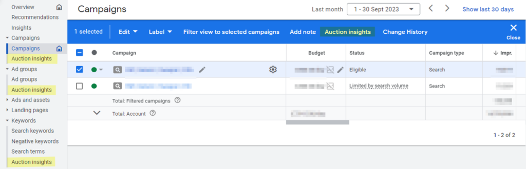
Once done, you’re in the auction insights report for the element you selected:
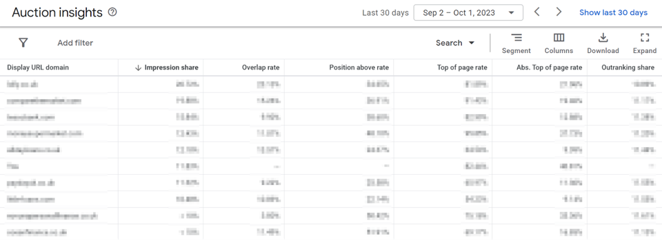
As you can see, the format in the UI is not really suitable for any rigorous analysis:
- It’s a large grid of numbers and can be very hard to digest
- There is no good way to show changes over time in this report
A more effective method of accessing this data is to export the data out to a CSV (don’t forget to add the “Day” segment to show progression over time) and pivot this up using Excel or Sheets. It’s worth noting that each of the metrics in use are percentages, so avoid adding these together or averaging them out.
In addition to showing progression over time, using this method you can obtain a summary of what is happening.
But there are some drawbacks:
- It can take time to export and pivot the data to get the view you need – this can get very repetitive and may mean you’re less likely to check in regularly.
- This approach is also prone to human error. An example of this could be when columns are exported in a different order than usual, which goes unnoticed during analysis.
- There is no link to performance metrics through this method unless another data pull is added, further increasing time spent managing data sets.
2. Overview Table
Google Ads has provided a (arguably underused) tool that helps address some of the shortcomings listed above.
Through checking the Overview tab of a campaign or ad group, you’ll see the following widget which plots out auction insight data for you:
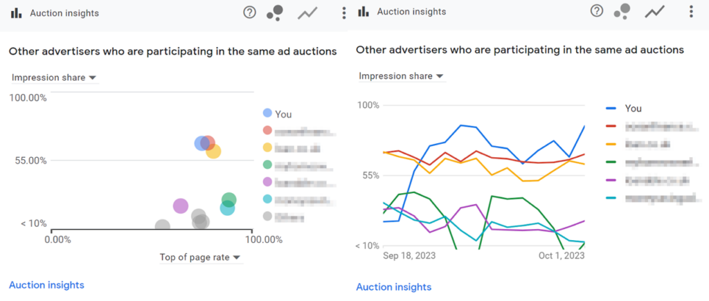
You can switch the metric you are looking at (from impression share through to absolute top impression share), and even export this data to a CSV if needed using the dropdown.
Whilst this widget solves the primary issue with the auction insight report in the UI (no progression over time), it’s still not perfect:
- There is no way to filter the competitor set being looked at.
- It is clunky moving between campaigns or ad groups.
- There is no easy way to link this to performance data, or to add in segments such as device.
3. Automated Dashboard
Using a tool such as Looker Studio and this useful community visualisation tool, you can also access auction insight data by creating an automated dashboard. Below is an example showing a stable summary, impression share over time, and the performance of key metrics throughout the period:
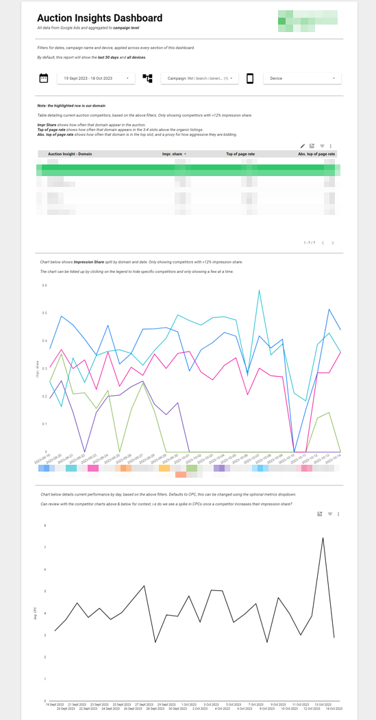
Thanks to Looker Studio, after the required initial setup, this is automatically kept up to date, acting as a central hub to run analysis. The three big benefits an automated dashboard provide are:
- It reduces avenues for human error
- There is no need to export and manage data.
- It provides the ability to slice the data in different ways using filters and selectors
- Users can quickly select the campaign, date range and device needed, without worrying whether that segment is in the raw data file.
- Users can easily visualise auction insight data alongside performance data
- Cost per click (CPC) is one of the most useful metrics to do this with, shown in black in the above example.
This method offers the most advantages, however there are some drawbacks:
- There are limitations on granularity (Looker Studio only supports campaign level segmentation of auction insight data)
- There is some upfront investment of time required for setup
In summary
Each option has its pros and cons, in summary:
- Exporting the data into Excel or Sheets via the Auction Insight Report, as described in option 1, is a solid choice as it gives a lot of flexibility, at the cost of time spent managing data.
- Option 2 of using the Overview tab is a great starting point if you’re tight on time and want a quick snapshot of where you are, but you may not be able to get the exact view you need.
- Building an automated dashboard, in Option 3, is an excellent choice if you have the time and capability to get this setup, as it removes almost all the friction faced when getting the data ready for analysis.
Whichever method you’ve gone with, the next post in this series will cover examples of how to work with the data and conduct your analysis. If you need further support, our team can help.