UX
I recently read an article that described accessibility as one of the top web design trends of 2020. As a designer and web accessibility advocate, this was discouraging to read. The word “trend” associates accessible design with something that is temporarily ‘in-vogue’, topical, or a box-ticking exercise, rather than a fundamental responsibility for designers to create usable and enjoyable products and interfaces for all users, regardless of their ability level.
The business case for accessible web design is simple, yet powerful. According to Purple, an organisation that encourages organisations to improve the experience for consumers with disabilities, the spending power of people with disabilities is worth around £250bn in the UK, and around £16bn of this spending power takes place exclusively online. In terms of web traffic, Purple has reported that bounce rates due to inaccessible websites cause around £12bn worth of lost revenue each year. The more accessible your website or digital product is, the more revenue it will produce and the more customer satisfaction it will generate. Thinking about accessibility as a trend would be to ignore the long-term benefits of having accessible digital products.
However, it seems like today, many designers have lost sight of what makes our online experience so special. As Tim Berners Lee, the founder of the World Wide Web outlined in 1997: “The power of the web is in its universality. Access by everyone regardless of disability is an essential aspect.” Since then, the web has evolved at an immeasurable pace and has generated a new set of disciplines and creative practices that didn’t even exist at its conception. In the past few years, web designers have innovated and pushed creative boundaries, both in how digital products look and how we interact with them. As a result, web accessibility has taken more of a sideline role in modern web development and design.
During my time consulting businesses on including Accessibility and User Experience best practices within their digital products, I witnessed a subtle yet alarming discourse within the design community in which there is a reluctance to include accessibility into design workflows because there is a general misconception that this would either hinder the creative process, or negatively impact a product’s aesthetic value. This is simply not true. Along with the financial benefits, accessible websites have also been proven to enhance usability and overall customer satisfaction.
Whilst some solutions may require more long-term planning to broaden accessibility awareness and deepen knowledge within the structure of design teams, there are some very simple tweaks that can be included into designs that can enhance their accessibility without hindering any aesthetic value. Here we list some to get started right away:
To image carousel or not to image carousel…?

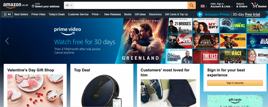
Image carousels are interactive components that showcase an idea, product, and are a real space saver on the page. Unfortunately, because their function is purely visual, screen readers often encounter difficulty translating information contained within image carousels, which may be lost entirely on blind users. These also need to be keyboard accessible for users with mobility impairments to interact with them. Think hard whether you need that image carousel, if you do, ensure it’s accessible by using aria labels to describe its functionality to screen reader users and ensure its interactive components are accessible by keyboard and have the necessary focus.
Automatic video playing on page load? Pause it

People who have anxiety, cognitive impairments or dyslexia can find automated videos on websites distracting or distressing. A simple fix is to incorporate a button that can let users pause these videos, so that they can carry on with their task. This also works for automated image carousels, as users with low vision may take longer to digest information and would like to pause on certain areas of information within the carousel.
Don’t describe with colour

Around 3 million people in the UK have some sort of colour blindness. If you use colour alone to display important information (such the colour red to highlight an error in a form), then some users may not be able to easily perceive this information. Ensure links are underlined, or bold, and that error messages in form elements are accompanied by icons or symbols. Graphs and graphics are also problematic as they rely on colour alone, so consider including shapes or dashed lines to help distinguish pieces of data within graphs.
Text as an image? Make it HTML

Any text that is within an image file will not be announced by screen readers, which means that blind users or people with dyslexia who rely on their assistive technology to read information on the page will not be able to access this information. Images of text can also negatively impact the SEO of a page, as this information will not be picked up by search engines. If an image is important, make sure to include descriptive alt text or convert the text into a heading or a paragraph tag in HTML. If the image is there for purely aesthetic reasons, use the background-image property on CSS, as this will be ignored by screen readers and will help users who rely on this assistive technology to focus on the most important parts on the page.
Break it up! … with headings

Having a strict heading hierarchy (from H1 to H6) in HTML will not only help screen reader users understand page structure and navigate through its content more easily, it will also improve SEO. Headings are also a great way to visually split up content on a page to enhance readability. It’s also important not to use headings to style content and remember that all stylistic decisions should be made in CSS, not HTML. This means your H3 can look bigger than your H1 if you style it that way in CSS and does not need to break the heading hierarchy, giving you the best of both worlds – style and an HTML that can be easily read by humans and computers alike.
Colour-contrast – an easy fix that can have a big impact

Saving the easiest and most common accessibility enhancement til last, make sure that your text has a high contrast against the page’s background. To pass the minimum requirements outlined in WCAG 2.1, paragraph text needs to have a minimum ratio of 4.5:1, whilst larger text needs to have a minimum contrast of 3:1. Important graphical elements such as buttons, or interactive components, also need to have a colour contrast of 3:1. Plugins such as Stark for design software will help you analyse the colours in your designs to ensure they are WCAG 2.1 AA compliant, and even give you suggestions for a more accessible colour palette. Otherwise, this in-browser colour-contrast checker is one of the quickest ways to find out if your colours are accessible.
By implementing these small changes in your designs, you’ll be one step closer to enhancing your digital product’s usability and accessibility, without sacrificing any aesthetic value. Using this approach in future design work will have long-term benefits for customers, as it will ensure they get a richer and more empowering experience, regardless of their ability level or use of assistive technology. This is why accessibility should not be viewed as just a trend in web design.
Charlotte Hills, Digital Designer, RocketMill
If you want to find out more about our User Experience & Creative skills or our Accessibility audit, please get in touch or speak to your Client Partner.