
Analytics
Can art, data, technology and digital marketing converge?
There are two very cool art exhibitions coming up that I’m excited about, because both are doing very interesting things with digital data and technology and there is something about their approach that has a lot of relevance to marketing.
The first is at Somerset House in London and is called Big Bang Data. With the proliferation of data (emails, selfies, online transactions, Google searches, social profiles and more) coupled with the new ways of storing and accessing that data, we have become a data-driven society. There are of course pros and cons to this, but this exhibition explores whether we really understand our relationship with and the capabilities of data.
The second is slightly further afield in Florida at The Dali Museum, which is going to be offering a virtual reality (VR) experience called Dreams of Dali. This will allow visitors to immerse themselves in one of Salvador Dali’s paintings by actually being able to move around inside the painting. Visitors will experience this through a VR headset but can also access it through mobile, desktop, Google Cardboard and Samsung’s Gear VR.
Why Are These Exhibitions Relevant to Marketing?
Firstly, Big Bang Data uses creativity to bring meaning to what could potentially be overwhelming and meaningless data.
There is something powerful in the approach taken here, in that the artists asked questions of the data and interrogated it to find meaning, which not only entertains us but also helps our understanding of the world.
Secondly, the VR experience at The Dali Museum brings a deeper level of understanding and insight to works of art that can otherwise feel difficult to get your head around. Not only does it enable visitors to get a new understanding and perspective on the art but fundamentally the Museum is selling a digital experience. Digital is being used to enhance the visitors’ experience and therefore make it even more valuable.
The creative approach by the artists and museum curators here is something marketers could learn from.
We should be interrogating and asking questions of the data – what extra meaning and understanding can it provide to a business and its operations? What experiences can we deliver that will add value to the consumer through activities such as content marketing? VR is likely to be a big theme for brands throughout 2016, so can the experiments of curators and the crossover between developers and artists give brands a starter for ten in VR?
A Picture is worth a Thousand Words
There are lots of ways for marketers to find meaning in data, but translating that into a narrative (or picture) to make business decisions by can be harder. This is especially the case when you need that picture to say a thousand words to a non-data experienced or non-marketing audience.
Any time a Marketer needs to tell a story to a non-marketing audience, they’ll be doing for one of two reasons:
Forecasting: Predicting the future based on historical performance.
Reporting: Using historical performance to determine future actions.
Let’s look at a couple of examples of how art, data and technology can converge to help digital marketers work more effectively in these two scenarios.
Forecasting
Forecasting performance comes with the understanding that all models are wrong, but some are useful. As in, we can never predict the future with 100% accuracy but some predictive models can give us an understanding of where our current strategy is taking us.
To try and make building these predictive models easier, we created Forecaster. It safely, securely and anonymously connects to your Google Analytics data and crunches your numbers to give you three different predictive models.
In seconds, you’ll have a forecast to make decisions on.
Oh, and did we mention it’s free.
Launch Forecaster
Reporting
A truly powerful dashboard will tell a non-marketer a story about performance at glance. Done correctly, a dashboard is a perfect example of how art, data and technology converge. Done incorrectly, and they are just a confusing mess.
Our advice for building a dashboard is quite simple:
- Only report on metrics that you are prepared to act on
- Display the dashboard prominently
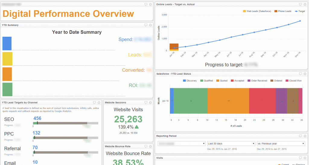
Above is an example of a dashboard we built for a client. We’ve blurred out their details but you can see that in an instant how digital marketing is contributing to the business by generating leads.
Each of the modules is something that can prompt action. For example, the Lead Status module allows for clear and direct communication between Sales and Marketing to improve the process of lead qualification, response times and lead recycling.
The dashboard is currently placed front and centre in the offices on a large TV screen for all to see. There are no hiding from these numbers!
Are you using dashboards to visualise your sales and marketing performance? What are your tips for making dashboards more useful? Please share your ideas @rocketmill
Do You Want to Participate in a Beta?
As you’ll know Google’s Search Console only stores 90 days of data, which makes it pretty difficult to track performance over an extended period of time.
We’ve developed a way to extract, store and analyse SEO data from Search Console and then use BigQuery to turn the data into visual stories. Again, another example of converging art, data and technology.
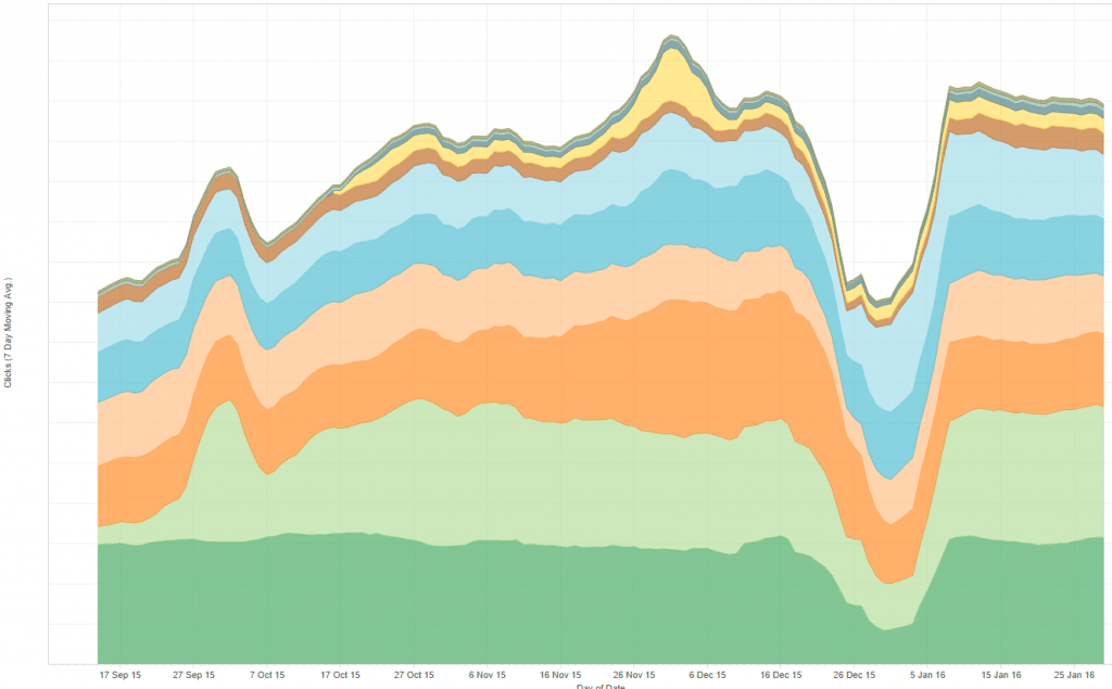
After crunching about 30million data points, we’re starting to get a clear understanding of how organic reach and engagement affects revenue over the long term. If you’d like to get a better understanding of how organic search is impacting your business, please get in touch and we’ll happily discuss how you can join our Beta.